Insert your order number
Approximate recieve date

For the past year, the Pantone Colour Institute has been presenting its vision of the trendy colours of each season. Spring 2017 is a mixture of life, relaxation and nature. These bright lively shades bring us as close as possible to natural beauty, in a good way grounds us.


For the past year, the Pantone Colour Institute has been presenting its vision of the trendy colours of each season. Spring 2017 is a mixture of life, relaxation and nature. These are bright lively shades that bring us as close as possible to natural beauty, in a good way grounds us.
Letrice Eiseman, executive director of the Panton Colour Institute, believes the new trend collection is reminiscent of the shades that surround us in nature. Our Spring 2017 Fashion Colour Report provokes a range of emotions and feelings. From the warmth of sunny days with Pantone 13-0755 Primrose Yellow to the invigorating breath of fresh mountain air with Pantone 18-0107 and the desire to escape to clear waters with Pantone 14-4620 Island Paradise. We, 24print have noticed that in 2017 the sense of perception of reality has changed, it goes beyond tradition, - says Letrice Eiseman.
The 2017 collection includes two green shades:
PANTONE 15-0343 Greenery
 Green foliage is a refreshing combination of yellow and green colours. According to Pantone, this colour encourages exploring, inventing and experimenting. This colour causes you to stop and inhale pure oxygen.
PANTONE 18-0107 Kale
The colour of green cabbage (kale) based on green foliage, conjures up our desire to connect with nature. This lush and fertile natural green hue provides a wonderful must to turn to the brighter tones in the palette.
PANTONE 13-0755 Primrose Yellow This pale-yellow hue sparkles with warmth and survivability. Inviting us to its instant warm glow, this joyful yellow hue takes us to a paradise filled with enthusiasm, good mood and sun.
PANTONE 17-1462 Flame Red-orange colour (fiery) - it is loved by all for what it resembles, Fun, Bright and cheerful, this amazingly theatrical hue adds fiery warmth to the spring palette of 2017.
PANTONE 17-2034 Pink Yarrow
A fantastic, unignorable hue that attracts and beckons. Bold, lively, vibrant, stimulative and fascinating it lifts the mood and charges the body with a new dose of adrenaline.
Dark blue-blue range in shades:
PANTONE 14-4620 Island Paradise
A shade of refreshing sea water that reminds you that somewhere there is an incredible landscape. A cool blue-green hue that speaks of our dream of escaping to a paradise island. It symbolizes the tropics, where you can unwind and relax.
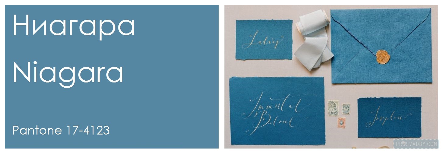
PANTONE 17-4123 Niagara
Comfortable and reliable, Niagara believes Pantone will be one of the key fashions colours as it was the most common colour during spring 2017. It is this grey-blue hue similar to the classic blue denim that speaks of our desire for lightness and relaxation.
PANTONE 19-4045 Lapis Blue
The shade that transfers even more energy is the blue azure. Strong and confident, this intense blue hue is filled with inner radiance. It gives strength and self-confidence.
Not without delicate pastel shades:
PANTONE 13-1404 Pale Dogwood The calm mood is expressed by a pale dogwood - a quiet and peaceful pink hue, which symbolizes the aura of innocence and purity. Inconspicuous non-serious pink, gives all the characteristics of a gentle glow.
PANTONE 14-1315 Hazelnut The list of spring fashionable colours of 2017 is completed by the main shade of hazelnuts in the spring palette. This shade resembles a natural landing. Unpretentious, with its inherent warmth. Hazelnut - a transitional colour that easily connects different seasons.
Source: http://www.pantone.com/fashion-color-report-spring-2017
More articles on the topic
3rd of March - 2021
How to combine two files into one PDF
To prepare a layout for printing, it is important to be able to properly save and combine files.
8th of December - 2020
How to create a PDF file
Check out a few steps to help you learn how to resave almost any format to PDF.
27th of December - 2020
Printing on T-shirts: which type of printing to choose
Contact our manager
We love it when you're happy and want to know when something went wrong. Write a review about the 24print service to the founder of the company.
SITE MAP
sitemap.html
OUR CONTACTS
+38 067 247 24 27
[email protected]
24/7 IN ALL MESSENGERS
facebook
instagram
youtube
OUR LOCATIONS
Antonovycha, 50
MS "Olimpiiska"
Yaroslavska, 10
MS "Kontraktova ploshcha"
Ivana Franka, 25/40
MS "Zoloti vorota"
Link copied

You can find us and contact you


Пн-Пт 09:00–21:00
Сб-Нд 10:00–19:00
